 Does beautiful design matter?
If you look at the success of some of the most popular sites on the web, it seems to be a mixed verdict. Yes, many have had beautiful designs for years, but for some well-known sites, aesthetics promptly took a backseat to form and function… and stayed there.
And surprisingly, most of their visitors don’t seem to care.
There’s something comforting about a homely design. The average site portrays a kind of “mom and pop” flair that instantly lowers people’s built-in B.S. detectors and says, “Hey, we’re just like you!”
In fact, these ugly sites have gained such a fanatically loyal audience over the years that their owners wouldn’t dream of updating their design today. They pride themselves on a site that may not be much to look at, but it’s incredibly easy to use and understand.
Here are four such sites, as well as lessons we can learn from them:
eBay
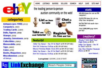
By today’s standards, eBay did everything wrong. Back in 1997, they plastered the site with banners, browser buttons, and a cluttered logo that breaks the rules of good logo design.
Today, they’ve toned down their elementary school-inspired color scheme, nixed the banners and provided a clearer path to action on the homepage, and their logo remains one of the most recognizable in the world.
But it’s still pretty ugly.
What We Can Learn from eBay:
 EBay’s pages are designed to take you to the products you want to buy, as quickly as possible. It’s not just because that’s what’s profitable. It’s what people come to eBay to do: buy stuff. EBay knows this, and so the entire website is designed to help them.
If you’re running an e-commerce site, it’s a good approach to model, because everyone pretty much understands it. Even 80 year old grandmothers are supplementing their retirement income by selling stuff on eBay — and you know if grandma can use the website, it must be doing something right!
PlentyOfFish
Widely considered the most popular dating site in the US and Canada, if not the world, PlentyOfFish boasts 20, 000 new sign ups every day and has an estimated 11 million users. In 2008, the website earned over $10 million with only a handful of employees. (Source: Wikipedia)
Oh, and did I mention it’s free?
PlentyOfFish doesn’t appear to have nearly the flashy technology or depth as, say, Match.com, but it doesn’t need to. It makes money from selling ads, as well as upgraded memberships to put local listings at the top of search results.
What We Can Learn from PlentyOfFish:
 Take away all of the dating hoopla, and PlentyOfFish is essentially a huge online community, and like most online communities, the value comes from its size. The reason the free revenue model works so well for it is because it encourages the maximum number of people to sign up.
If you’re starting an online community, you might want to use a similar strategy. Instead of investing time and money into creating a flashy, impressive website that works better than your competitors, just focus on what people really want: having lots of other people around. And making it free is often a great way to do that.
Can we really call Google “ugly?”
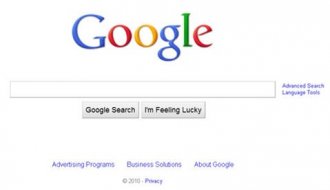
Well, maybe or maybe not, but it’s certainly spartan. Over the years, countless competitors have tried to spring up with more stylish, feature-rich layouts, but Google has so far beaten them all, remaining the undisputed king of the search engine hill.
In fact, Google seems to take pride in its minimalist designs. And why not? It’s one of the most popular websites in the world, and in 2009, they brought in almost $24 billion in revenue. Something seems to be working.
What We Can Learn from Google:
Remove the clutter.
Back when Google first started, it’s simple design was one of its biggest selling points. Everyone was used to the packed, portal-style homepages like Yahoo, and they were actually relieved to see such a simple page.
And it’s a lesson that applies to a lot more than just search. For example:
- If visitors come to your website in search of a price quote, you could make your home page a calculator of sorts, asking them the necessary questions and then spitting out an estimate
- If your audience consists mainly of beginners looking for information on a certain topic, you could publish a PDF beginner’s guide to your topic and then give it away on your home page
- If your people are coming to your website to schedule an appointment, you could make your home page a calendar, where they can click a day and schedule a time
The key is to find out what task your audience wants to accomplish and then make it the focus of your website.
INTERESTING VIDEO


